How to create a modal with ReactJS and style it with TailwindCSS.

Introduction
ReactJS is a great library and If you combine it with TailwindCSS they become the best couple in the programming world :)
Today I will write about how to create a modal using ReactJS and style it with TailwindCSS.
Caution: ReactJS version ^18.2.0 is used in this tutorial.
Create A New React Project with TailwindCSS
To create a react project on your computer please make sure that NPM is already installed.
If you're ready, let's run the following command on your terminal or command prompt to create a react project called my-project.
npx create-react-app my-project
Change your current directory into the project folder by using the following command.
cd my-project
Since you're now in the project folder let's run the following command to include TailwindCSS with other dependencies into the project.
npm install -D tailwindcss postcss autoprefixer
Once this command is completed and the TailwindCSS is installed then run the following command to create configuration files for TailwindCSS and PostCSS.
npx tailwindcss init -p
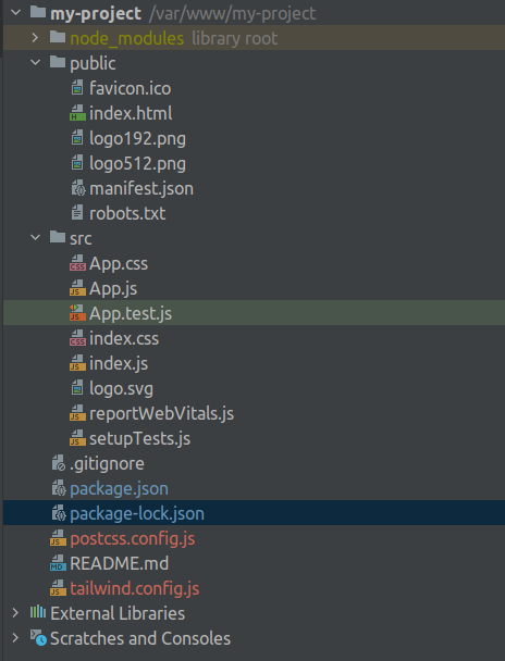
If you've done everything correctly then you'll have the same following project structure.
At this point, we have to make some configuration changes in the tailwind.config.js file to tell which files will have TailwindCSS classes on them.
Let's add the following configuration to the file.
/** @type {import('tailwindcss').Config} */
module.exports = {
  content: [
    "./src/**/*.{js,jsx,ts,tsx}",
  ],
  theme: {
    extend: {},
  },
  plugins: [],
}
Also we need to add TailwindCSS directives into the src/index.css file to include TailwindCSS.
@tailwind base;
@tailwind components;
@tailwind utilities;
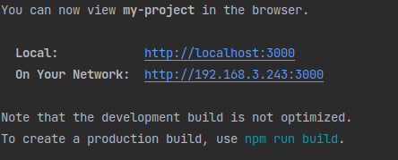
We're almost done with TailwindCSS integration, So just run the following command to run the application.
npm run start
If everything goes right then you'll see some messages in terminal like below.
If you go to one of the URLs provided to you (your URLs can be different than mine) then you'll see the following screen.
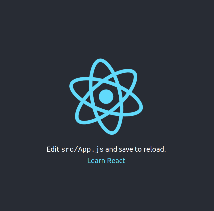
Congratulations 👏👏
Create Modal Component
Our application is running and we are ready to create a lovely modal component.
So, let's create a file named modal.jsx in src folder.
After you created the file add the following piece of code into this file to convert it into the simple react component.
export function Modal({children}) {
    return (
        <div className="relative z-50">
            <div className="fixed inset-0 bg-black/10" aria-hidden="true"/>

            <div className="fixed inset-0 flex items-center justify-center p-4">
                <div className="flex min-h-full items-center justify-center">
                    {children}
                </div>
            </div>
        </div>
    );
}
Anywhere in our application, we can inject this component by calling it with the tag of Modal.
Let's add the following code into App.js to show the modal component whenever we click Open Modal button.
import {Modal} from "./modal";
import {useState} from "react";

function App() {
    const [open, setOpen] = useState(false);

    return (
        <div className="relative min-h-screen">
            <div className="flex flex-col items-center my-24">
                <button onClick={() => setOpen(!open)} className="py-2 px-4 bg-blue-500 hover:bg-blue-600 text-white font-bold text-lg rounded-full">Open Modal</button>
            </div>

            {open ? <Modal>
                <div className="flex flex-col gap-2 bg-white px-4 pb-4 rounded-lg">
                    <h1 className="text-lg text-black mt-2 pr-48">This is my modal title</h1>
                    <hr/>
                    <div className="flex flex-col gap-2">
                        <label htmlFor="email">Please enter your email address.</label>
                        <input id="email" type="email" className="py-2 px-4 border border-gray-200 rounded-lg" placeholder="E.g: test@gmail.com"/>
                    </div>
                    <hr/>
                    <div className="flex flex-row gap-2">
                        <button onClick={() => setOpen(!open)} className="flex-1 py-2 px-4 bg-gray-500 hover:bg-gray-600 text-white font-bold text-lg rounded-full">Close</button>
                        <button onClick={() => setOpen(!open)} className="flex-1 py-2 px-4 bg-blue-500 hover:bg-blue-600 text-white font-bold text-lg rounded-full">Save</button>
                    </div>
                </div>
            </Modal> : null}
        </div>
    );
}

export default App;
Let's understand how does actually it works;
First of all, we created a state open and we surrounded it with useState hook. So we can change the state of the open by calling setState method.
We created a button and named it as Open Modal, whenever it's clicked we change the state of open to true.
Whenever the state of the open becomes true, then we inject Modal component into our page.